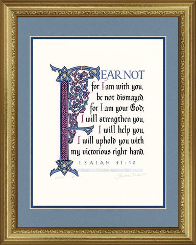


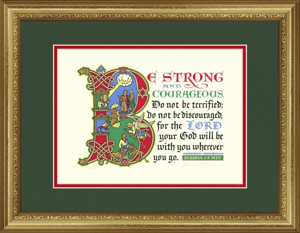


Joshua 1:9 NIV
Joshua 1:9, Acid-free, original graphic (screen printing serigraph process) archival quality print, signed and numbered by the artist with fade-proof inks containing genuine pigments. "Be strong and courageous. Do not be terrified; do not be discouraged; for the Lord your God will be with you wherever you go."
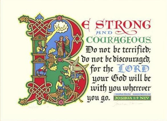
A Word From The Artist About Joshua 1:9
Could there be a better example of being strong and courageous than Daniel? These illustrations are taken from Daniel chapter 6. Allow me to refresh your memory: Some government officials who were jealous of Daniel’s success persuaded King Darius to pass a law that anyone caught praying to any god but Darius would be thrown into the lion’s den. As pictured in the upper part of the initial B, Daniel continued to pray three times a day, with his window open toward Jerusalem. Frequently in the Bible and in Hebrew art, God appears in a cloud; that tradition is followed here. The jealous accusers are visible within the upper bowl of the B. Consequently, Daniel finds himself in the lion’s den (depicted in the lower bowl). Early next morning, a concerned King Darius leans out another window to see if there’s anything left of his best administrator. Daniel replies that, yes, the Lord sent his angel to protect him. Darius is so impressed that he issues a decree that all people in the Persian Empire must reverence the true God. Daniel’s courage in the face of opposition brought great glory to the Almighty.
These themes required a style that would communicate with boldness, strength, and directness. Romanesque manuscripts of the Twelfth century (particularly the Winchester Bible) exhibit these virtues in abundance. The Romanesque artists drew their artistic motifs from many sources. Celtic art contributed the knotwork (at the top and bottom of the stem of the initial), and the animal-head finials. Classic Roman art gave them the lively figure drawing and the leaf ornament (derived from the Acanthus plant) seen at the very top and smack in the middle of the B. But the Romanesque artists combined these elements with their own special panache, using their initial letters as settings for dramatic action. In some ways their style resembles modern cartooning, achieving maximum impact with simplicity of execution. My lions (which come directly from manuscripts made at Mt. St. Michael, an island in the English Channel) show this most clearly.
The three lines of colored capital letters are in a style usually called Lombardic. In the Winchester Bible similar letters appear in alternating lines of red, blue, and green. Although the text of Winchester was written in a very early form of Gothic script, I have chosen (rather anachronistically) to use a more mature form of Gothic for the body text. Why? I just like it better; it seems stronger and more resolute.
It is traditional in English Bibles to represent the Divine Name by the word “LORD” in all capital letters. I usually counsel calligraphers not to use all capitals in Gothic script; but I have good historical precedent for making an exception: the first edition of the King James Version (which was printed in Gothic type) uses all Gothic caps for the Lord.
I pray that this art will remind you that the Lord is with you, and that this will give you courage to face every challenge.
—Jonathan Blocher